Sunday, April 18, 2010

Design 75


This is my final unicorn image that I will be closing with. The reason I picked this picture was because of the different types of purple that caught my eye right away. I love how it looks with space behind the unicorn giving it a more fantasy feel to it. I also like how the unicorn is a silhouette against the background to make it stand out more. I really like this picture and I love the different shades of purples they use.

Design 74

http://anniemsson.deviantart.com/art/Flutterbye-Kitten-161125092

It looks like something that a kid would draw but it isn't, the coloring is to well done for a kid to do. I love the shadows this person put into the picture as well as the border that looks really well done with the greens and reds. I also like the big eyes of the cat that pop out and make it look like its really cute. Over all I like this picture the person drew.


Design 73

http://darkjak.deviantart.com/art/Dratini-Shuppet-and-Mew-161192291


These are so cute, when I first saw them they caught my attention right away. The reason for this is because they are pokemon and someone design as figures. You can see how well they painted and took care of them. They are of the right colors and they shine because of the glos the person added to them.

Design 72

http://megson.deviantart.com/art/dreaming-about-blue-blue-sky-161129685


This photo is of a close up of a cats eye showing the details in it. I love how it's narrow in look and how it has green around the black of the eye. I also like how you can see some detail of the fur in some areas and not so much in other because the focus is mostly the eye. I also like how you can see the blue sky at the top of the cats eye.

Design 71

http://dennischunga.deviantart.com/art/Exhibition-161110318


Again in this image your eyes fallows the road all the way down wanting to know where it would lead. The foggyness of it gives you the feel like the road hardly gets any cars and the gray adds to the feel, showing that it didn't need color to make it stand out.

Design 70

http://artgerm.deviantart.com/art/Batgirl-12-161113594


This is a really cool design someone did of bat girl. The details in this is amazing showing close to what a comic book cover would have. They didn't put much detail in the background but that was okay because your eyes is mostly focus on the girl in front to worry about the background. Overall I really like the design and this artist should be a comic book cover designer.

Design 69

http://roux-s.deviantart.com/art/My-P-L-U-R-R-life-161103895

Really weird concept here but it works well together. It shows candy sticks sticking out from the ground. I like how it's design even though I don't know what it means. I think the whole piece works well with each other.

Design 68

http://gwarf.deviantart.com/art/Starman-161137606


The flowers blooming on the tree stands out really well against the blue background that has gradient added to it. I also love how the ground it white to add to the contrast of the background of this image. Overall everything works well with this picture and the photo is well taken as well.

Design 67

http://frekie999.deviantart.com/art/the-Grabbera-161118859


This design is really cool with the swirls of bluish green going down with the added of shapes and stuff around it. Along with the orange that makes the bluish green stand out more against the gray that is also in the design.

Design 66

http://utopic-man.deviantart.com/art/spirit-of-life-161141895


A forest scene with a ghostly figure in the background. I love how this person did this and the rays of sun coming though the trees adds to the feeling. Really well put together thought the photo could be better without the blurriness at the top.

Design 65

http://lozovoto-zaice.deviantart.com/art/Pink-Eyes-161136056


The design around the eyes is pretty with the swirls of pink flowing down the face and the shinyness of the eyes and lips makes everything stand out. They even photoshopped the eyes to make those pink as well to match everything overall. To me this design stands out really well and if it was any other light colors it would work just as well.

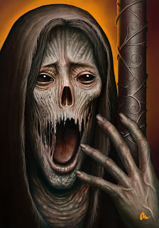
Design 64

http://almanegra.deviantart.com/art/the-challenger-of-death-161185819


This is a really cool design but it's still really freaky looking. There is a lot of detail put into the face and hands of this creature which over all works well. I like how it's design even though it's scary looking and might give me nightmares.

Design 63

http://kuzy62.deviantart.com/art/Ossamold-161147576


What ever this is it's really well done, I love the crystal balls that are at the ends of the green metal thing and how there is small disigns on the balls. I also like the spikyness of the middle part of the design making everything pretty.

Design 62

http://freezingrayne.deviantart.com/art/Not-So-Toothless-161098624

From the new movie that just came out called "How to train a dragon". It's a really cool drawing this person did putting more details into this picture then the movie had. I like how they did the moon in the background which is just as detailed as the dragon.

Design 61

http://pikminaaa.deviantart.com/art/industrial-perlyskian-161098950
I like how this is design, it's creepy but it does have good coloring added to it. I like how the eyes and wings glow green and stands out against the background and the brown of it's body. It's a really neat design of what ever it is.

Design 60

http://fahlaemee.deviantart.com/art/Hide-nd-Seek-161142093


This is a well taken shot of this bird. It's close up showing all the details plus the background is blur to make the bird stand out more against it. I love how this shot was taken and it's really cute with how it's colors are.

Design 59


http://taralen.deviantart.com/art/Final-Op-Logo-Design-161120916

This is a logo design that someone came up with. I like the font they use, making it seem like it's an old story type look. I also like the intercete design's in the background which stand out well with the red and gold colors.

Design 58

http://photo-sparta.deviantart.com/art/Kyra-and-Lotte-161163826

This phot was really well taken with the stopping of movement as the owl goes towards the girls hand. I love the detail that is shown in the foreground more so then the background. The owl stands out really well in this photo which I think is the main point, showing all the detail in this beautiful creature.

Design 57

http://crcunltd.deviantart.com/art/colors-of-life-161140666

I love this design very much because of how eye catching it is because of the black starry background. It has the feel of movement along with how it looks when you spin glow sticks in the dark. I really like this design and how techno it looks and the colors work so well together.

Design 56

http://uchihayuurei.deviantart.com/art/Grin-161109582

It's a close up of a frog which caught my eye right away because of it's bright color's. I love the details in the eyes and skin which I find really cool. I also like how the photographer made sure that the background was blur so that the frog stood out more.

Design 55

This picture is just too cute, I love how it's called teh jazz bird and has music notes under it's feet and in front of it showing it's making sound. I also like how there is building's in the background of the image making it stand out even more as a jazzy feel to the entire thing.

Design 54

http://my-shots.deviantart.com/art/Summer-41-161182626